A website is a centerpiece for your brand’s presence online. It tells the customers about your business and the products and services you offer. Apart from this, it also says a lot about the values you stand for, which is essential for the visitor to form a good first impression.
Website design is a crucial part of your website- it’s what makes the website responsive and functioning. But there are many myths about website design you should avoid at all times, which we’ll talk about in this article.
You don’t need a strategy, only visuals
Research suggests that 48% of people think that a website's design is their number one factor for deciding on the credibility of a business. This tells us how important visuals and designs are, but can you create them without a strategy?
If your website design doesn’t coincide with your brand’s content or personality, it’s as good as nothing. You need to have a clear strategy that relays everything from choosing a particular color to what kind of images you’re using in the design. This ensures your design aligns with the brand’s identity and represents your business in the truest sense.
Once you’re done designing, your work is finished
Contrary to this common misconception, your work gets twice as hard after you’ve finished designing the website. Once you have built the basic structure, your website will require routine checks to ensure its functioning properly.
Some common problems which begin and require a check after the website is designed are:
- Broken links and pages
- Non-responsiveness of designs
- Regular update of plugins
- Adding or tweaking of content to keep it fresh

You can check broken links using Ahrefs or deadlink checker
After your website goes live, these, among the other things, need to be kept under constant check.
You can only serve one segment of your target audience
You should indeed design your website as per your target audience, depending on what appeals to them. However, there’s no reason why your website design shouldn’t speak to multiple audiences.
Take an eCommerce store, for instance. They may have to cater to millennials, old age people, and new mothers. All of them wouldn’t want to navigate the website much to get what they want. So, for them, the website should be responsive and de-cluttered with lots of white spaces. Similarly, they may have one set of audiences in Santa Clarita and the other in a nearby region, so catering to both is important.
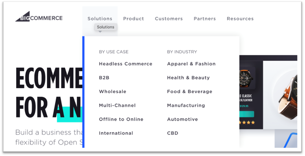
For E.g., Take a look at bigcommerce which offers easy navigation to users.
Draft a website design that caters to and is equally appealing to each segment of your audience.
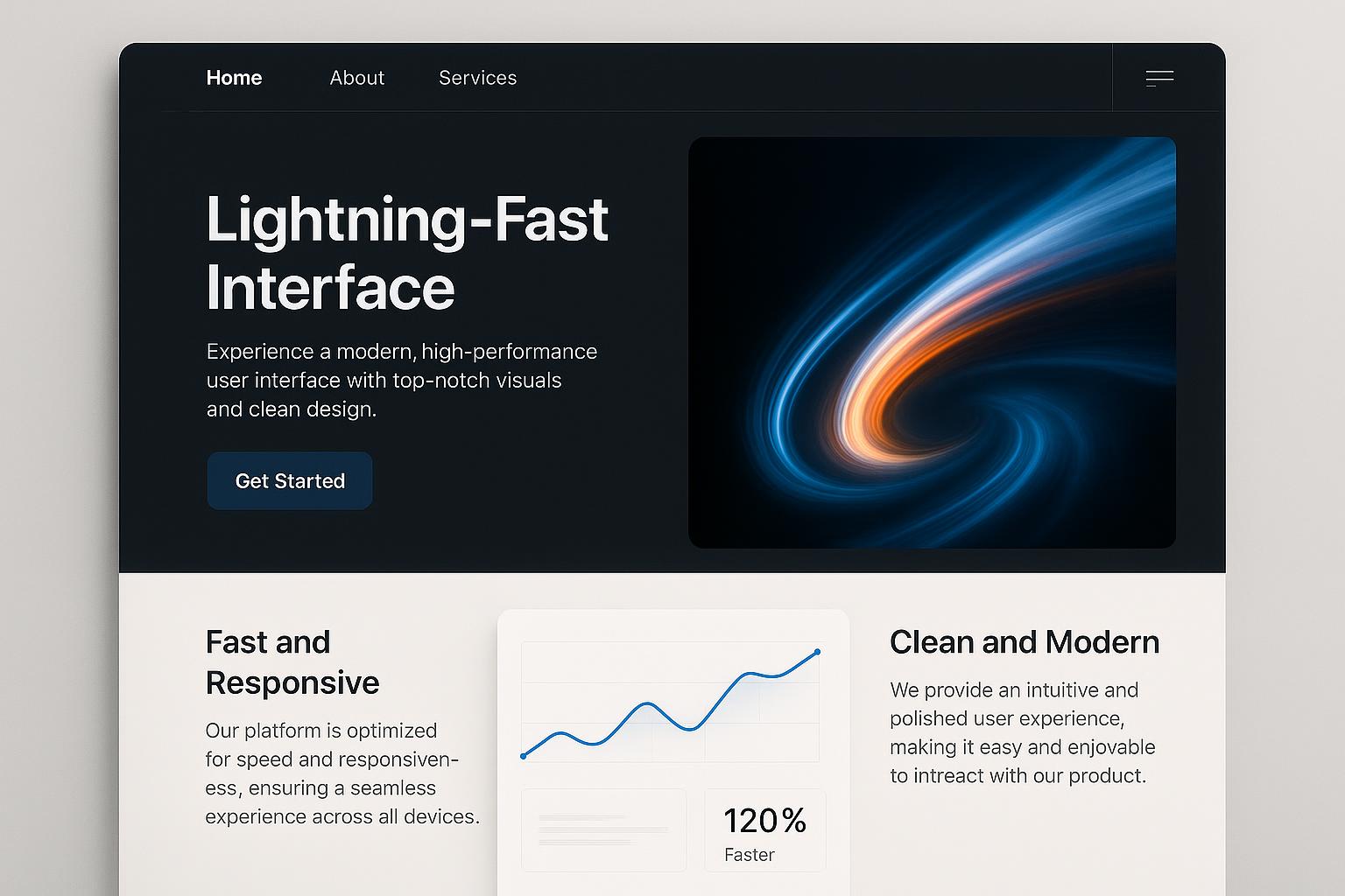
It’s all about the aesthetics
Having an aesthetically and visually appealing website is great. However, if you focus only on the design and visuals, the audience might leave your website for other reasons.
Aesthetics are a definite add-on to your website design, but other things like content and functionality play an equally important role as well. If your content doesn’t tell the user what to do next or the website pages don’t load fast enough- the user will bounce off no matter how visually attractive your design may be. So, focus on other aspects of your website to create a wholesome experience for your visitor.
The website should be filled with content
Yes, content is an important part of your website, but you don’t have to cram all the pages with it. High converting websites are those which allow content and design to complement each other.
If the visitor cannot find information relevant to them easily, they’ll bounce off the website. Keep the content on a strict need-to-know basis. For example, if the website is for a restaurant in Santa Clarita, you can talk about the place in a few lines instead of repeating it again and again on the same page.
The content should provide all basic information about your business- what you do, how you do it, and for whom.
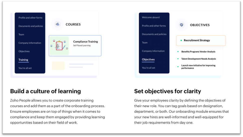
For E.g., Take a look at this section from Zoho - which not only has contents but also has pictures explaining all the details.
Apart from this, it should lead the visitor to the next course of action using persuasive words. So, cut out the fluff from your website and keep it crisp with straightforward content.
The customer only looks at the homepage
Your homepage is important, but you may need to rethink if you concentrate your design efforts solely on that. There’s quite a chance that your visitor doesn’t visit the homepage if they’re redirected from a link to the blog or a social media link connecting the product page.
With this perspective, if you solely focus on the homepage, it’ll hamper your website's overall image. You need to ensure that your efforts are equally spread throughout the website. Writing amazing content for the homepage and average content for other pages will not get good results. So, focus on the entire website.
Using stock photos works
Your website needs images, yes, but does it have to be stock photos? Probably not the best idea. Anyone with internet access can find stock photos, which will not be exclusive to your website. Using these would mean getting in line with the others and moving away from the uniqueness factor.
Moreover, when you click and use original pictures or make one of your own with illustrations, you add a touch of personalization to make all the difference.
More pages mean more clarity
Having an overcrowded website structure crammed with multiple drop-down menus will confuse your visitors. Make it a single-page website but stick to the concept of minimalism and having a clear-cut messaging strategy.
If a page on your website has less than 300-500 words, remove it altogether. Sum it up in a couple of lines and include it as part of your homepage. As a general rule of thumb, if a page doesn’t help your customers solve a problem or get further down the funnel, you don’t need it on your website.
Desktop-version is the only one you need
According to research, 85% of people say that a company’s mobile website should be as good or better than that on the desktop. This is because a major proportion of users today use the internet on their smartphones. So, the design should be equally responsive and fast there as well.
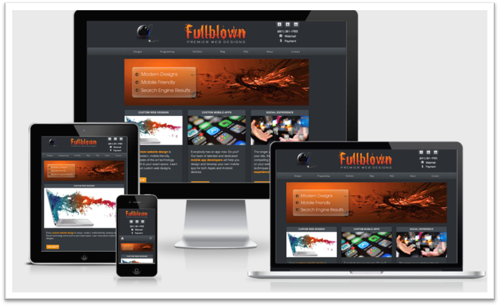
For E.g., Check the mobile responsiveness of our website.
For this, you need to separately optimize your website for mobile to ensure it has a responsive design there, too, else they may bounce off.
The CTA should be the first visible thing on the website
Having a call-to-action as soon as you open the website may help some of your visitors, but not all. Not everyone wants to be sold up on your offer; some might visit your website to scroll and check it out, and you need to respect that.
Instead of blindly following this myth, it would be best to do A/B testing of your CTA. Place it over the fold, so that’s the first thing visitors see as soon as they land on the website. And place the next one along the visitor’s natural reading path. Give it some time and then assess the click-through rate to see which placement got the best results.
Everyone has a unique set of audiences, which respond differently to website design. So, make sure you test it before following it.
Conclusion
There’s no doubt that once upon a time, these myths would have been true. But, with changing times and customer psychology, your website design methods also need a spruce up. So, make sure you’re aware of what you’re doing and have action-backed data about what everyone else is saying.
Website design is an extremely crucial aspect of conversions and a positive user experience. Pay precise attention to it if you want your website to yield the results you deserve.