
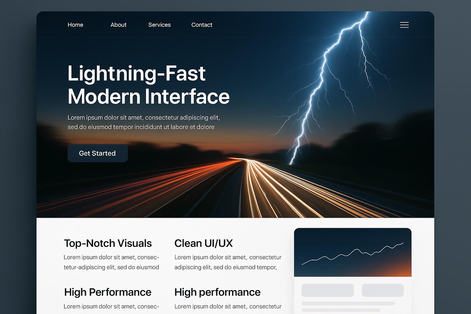
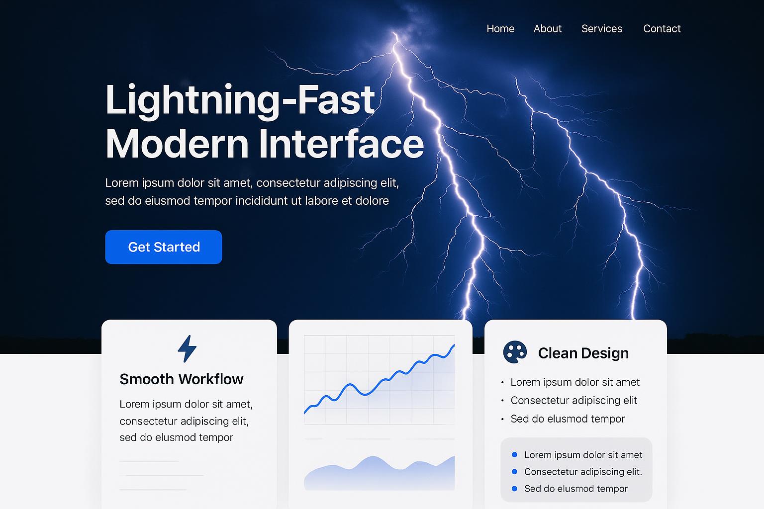
Enhancing Web Presence with Responsive ColdFusion Web Designs in Los Angeles
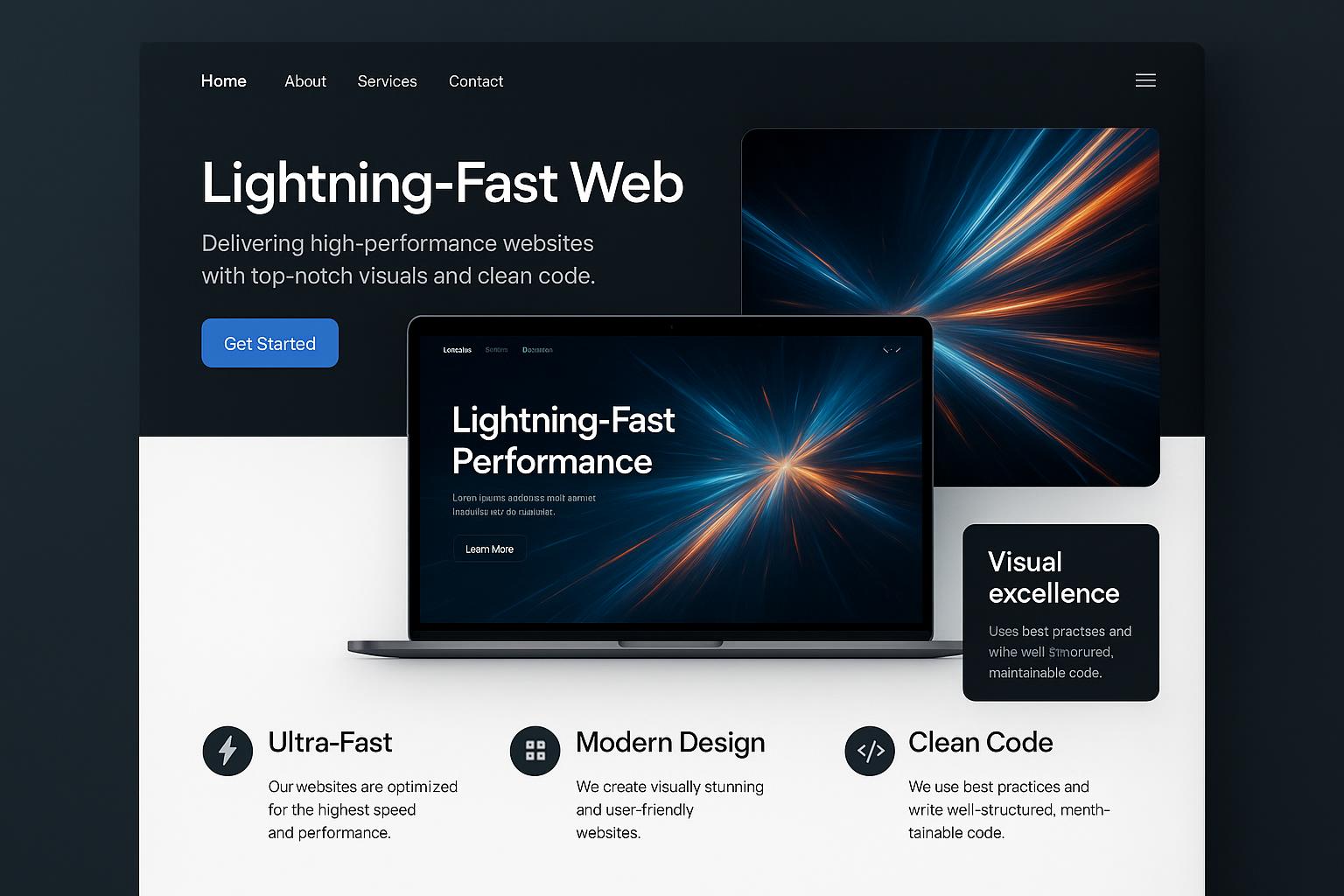
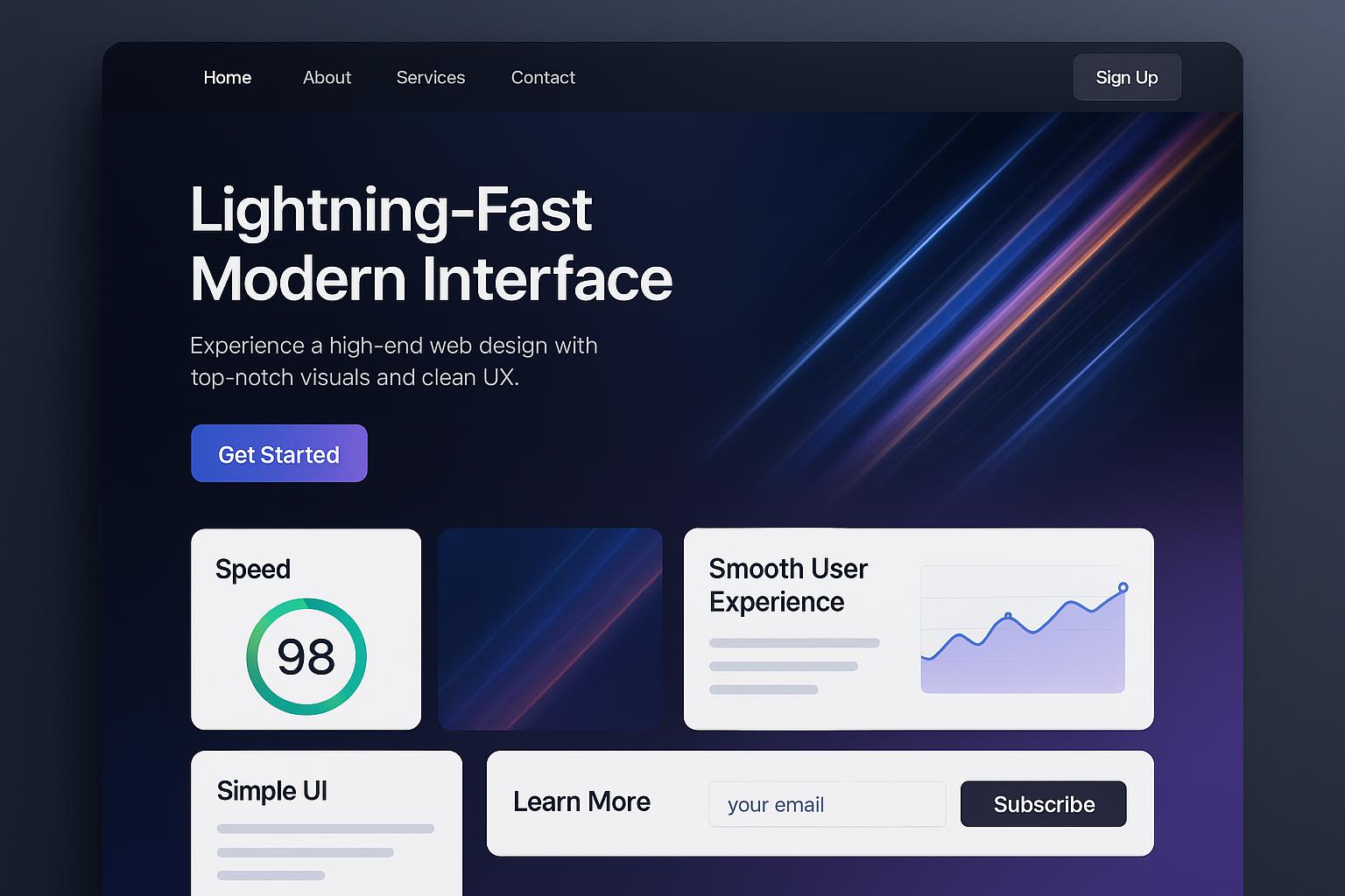
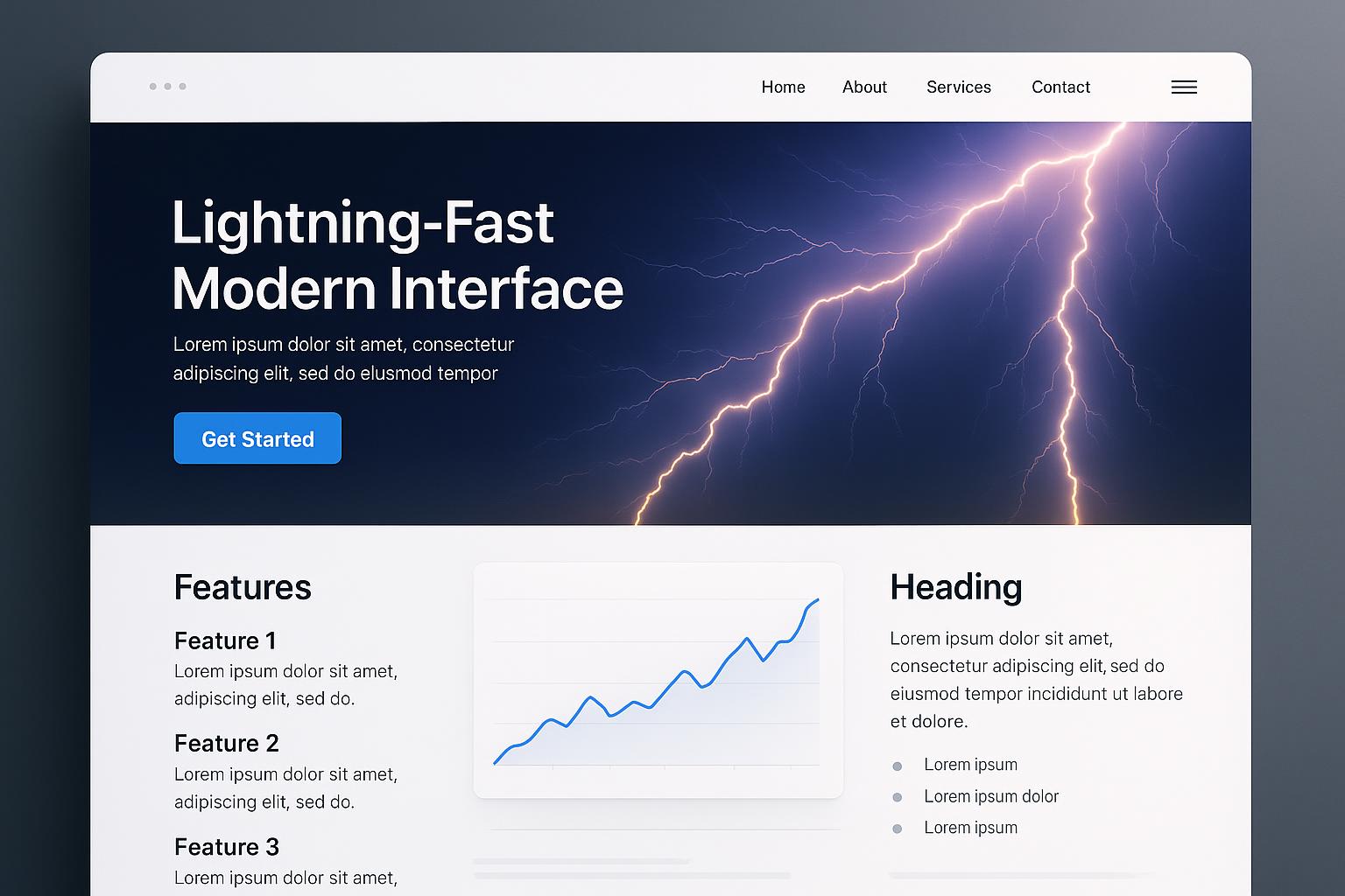
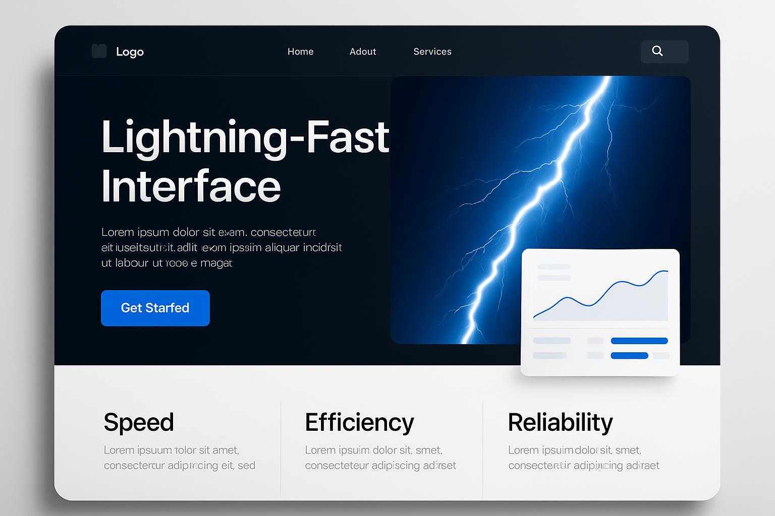
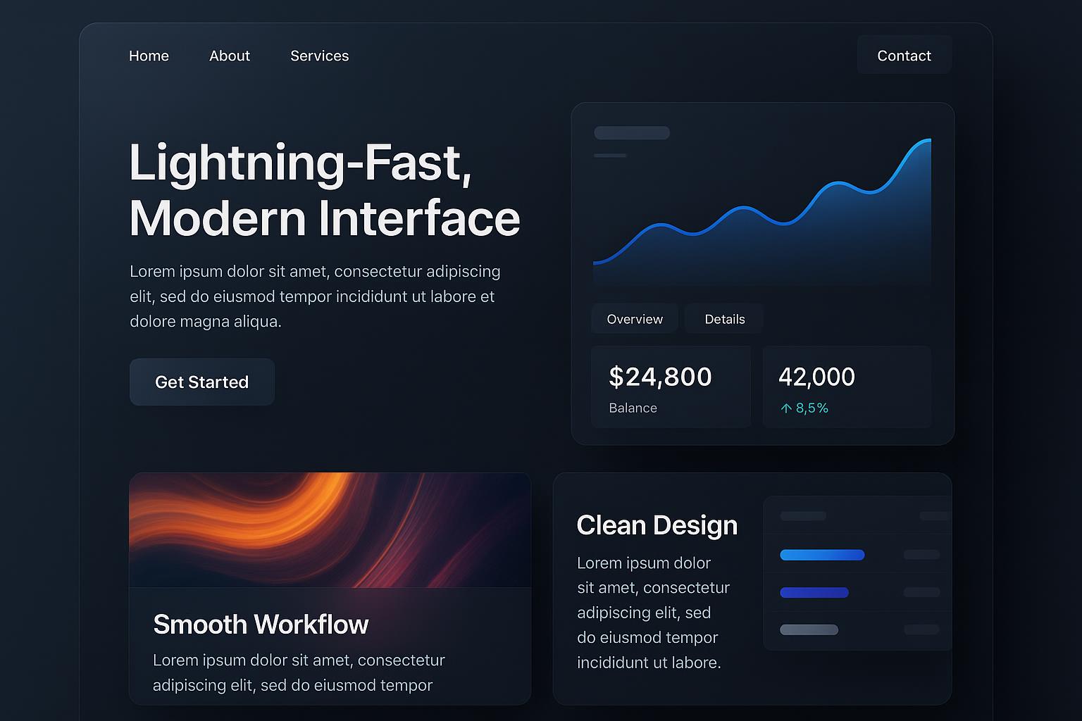
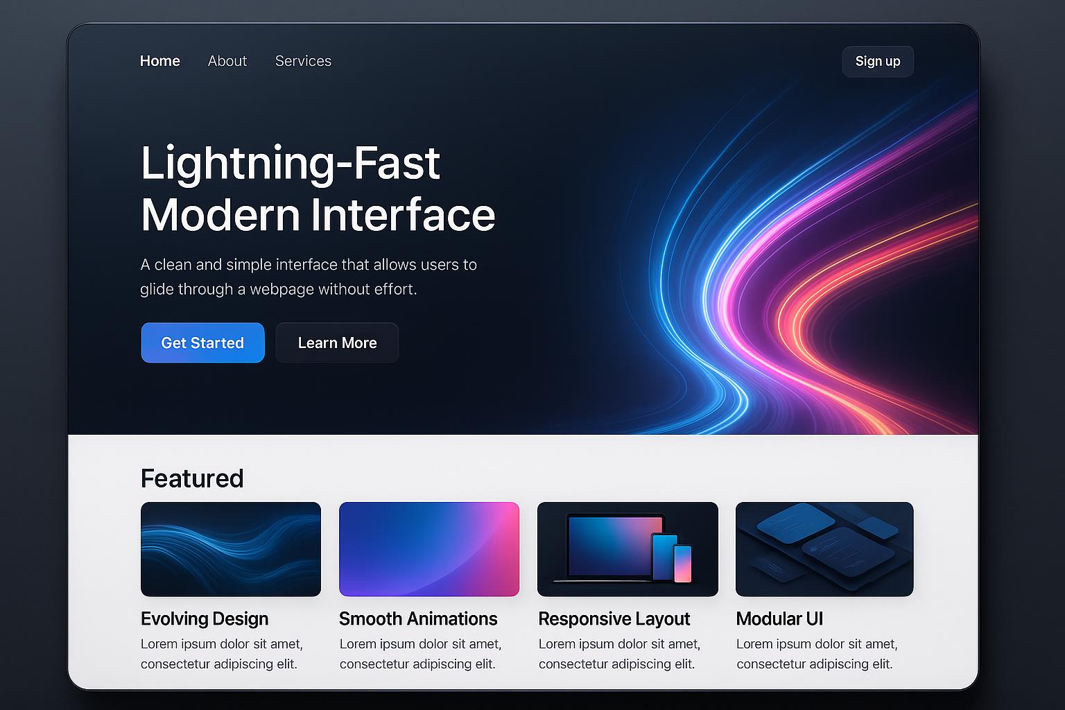
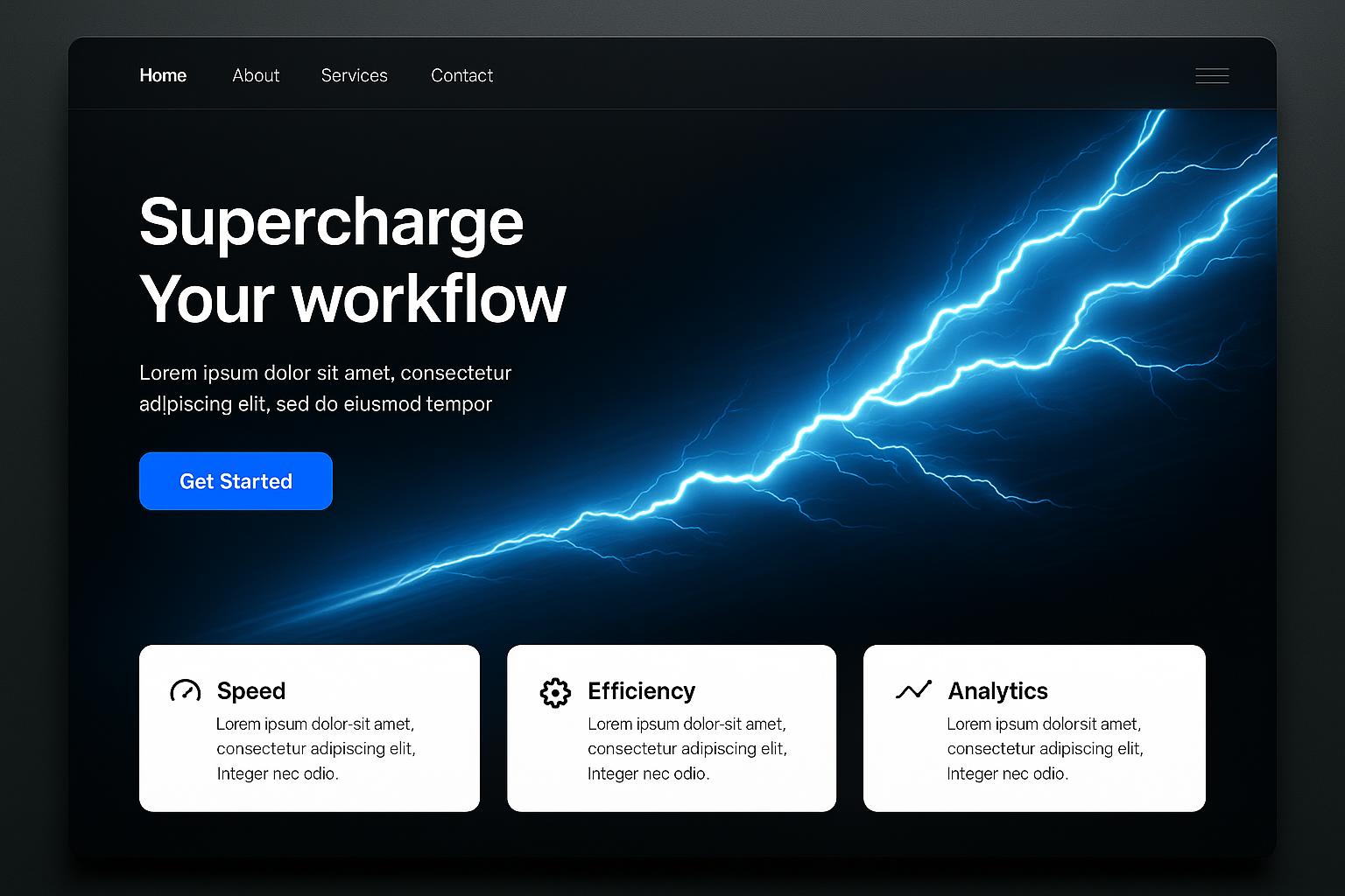
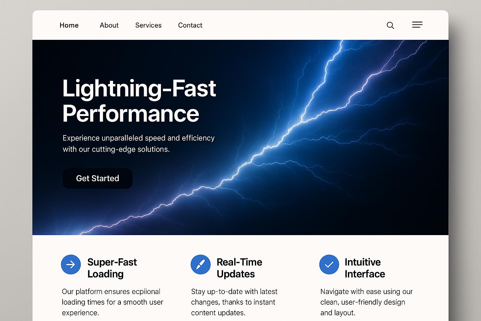
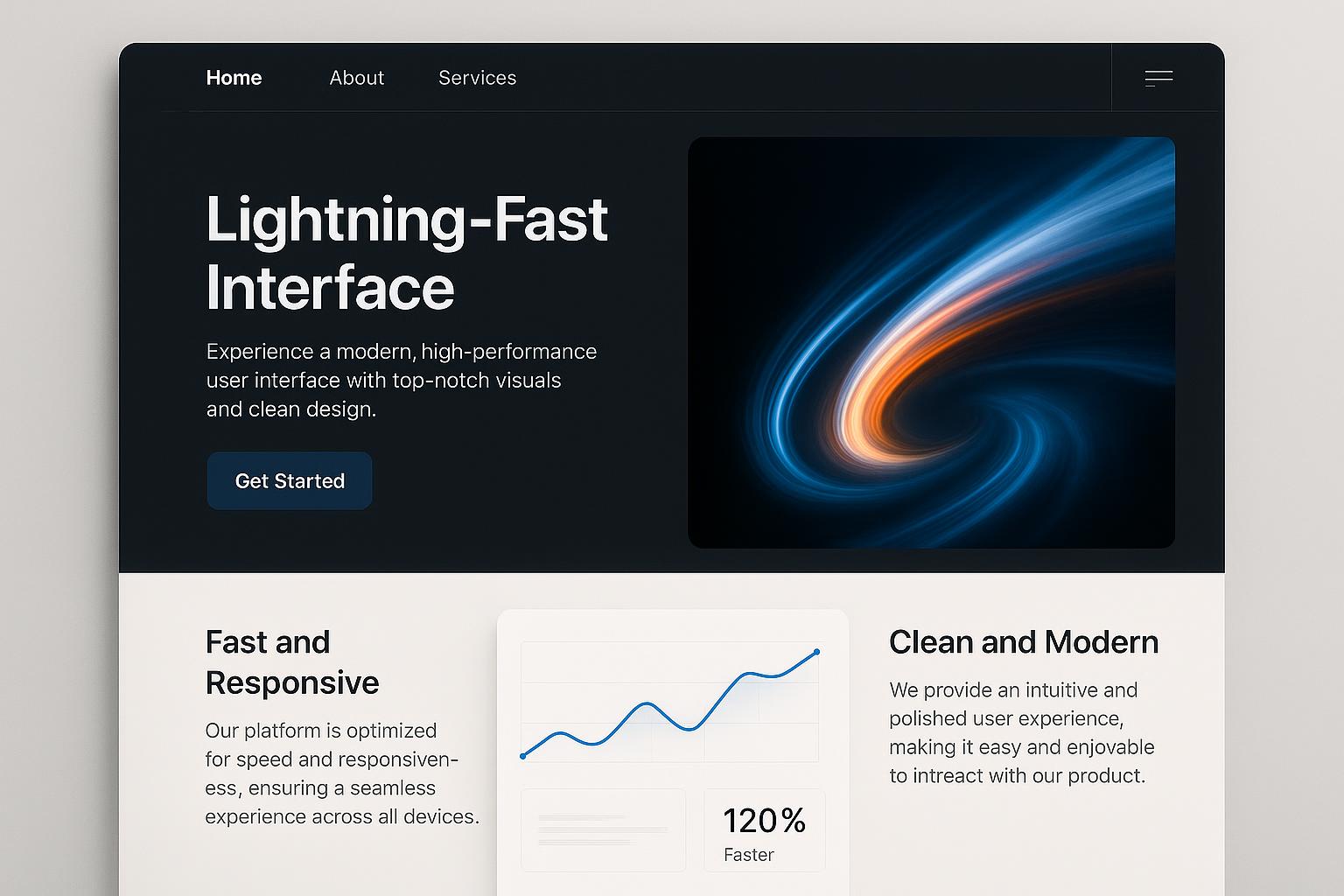
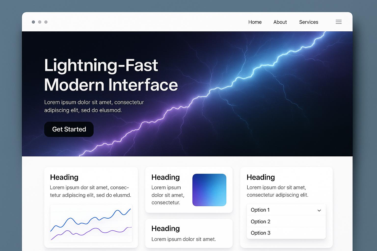
In today’s fast-paced digital landscape, having a website that adapts seamlessly across all devices is not just a luxury—it's a necessity. Responsive ColdFusion Web Designs have emerged as a powerful solution for businesses in Los Angeles seeking to deliver exceptional user experiences while maintaining robust functionality. These dynamic and flexible designs ensure your website looks stunning and operates flawlessly whether viewed on desktops, tablets, or smartphones, ultimately boosting engagement and conversions.
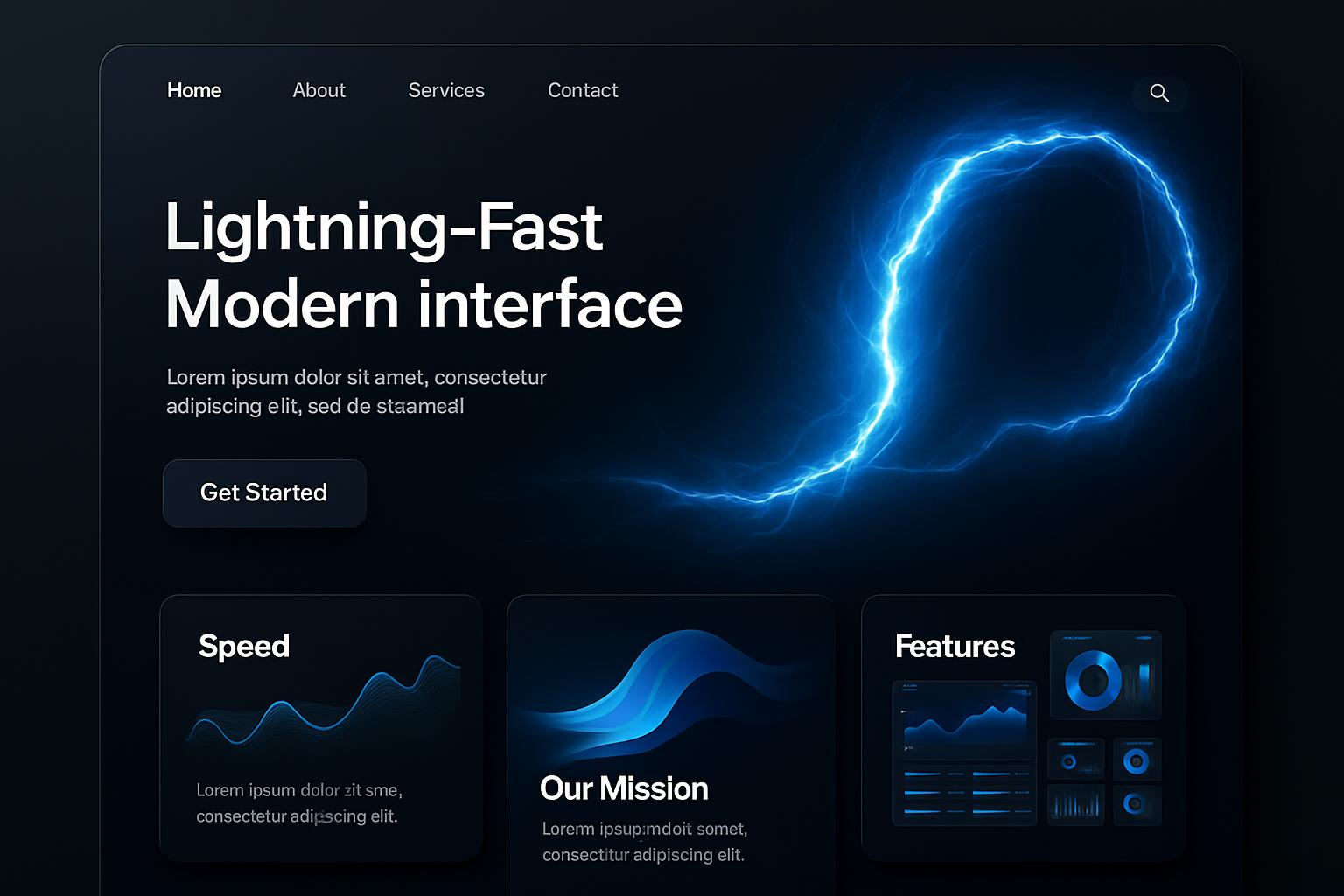
What Are Responsive ColdFusion Web Designs?
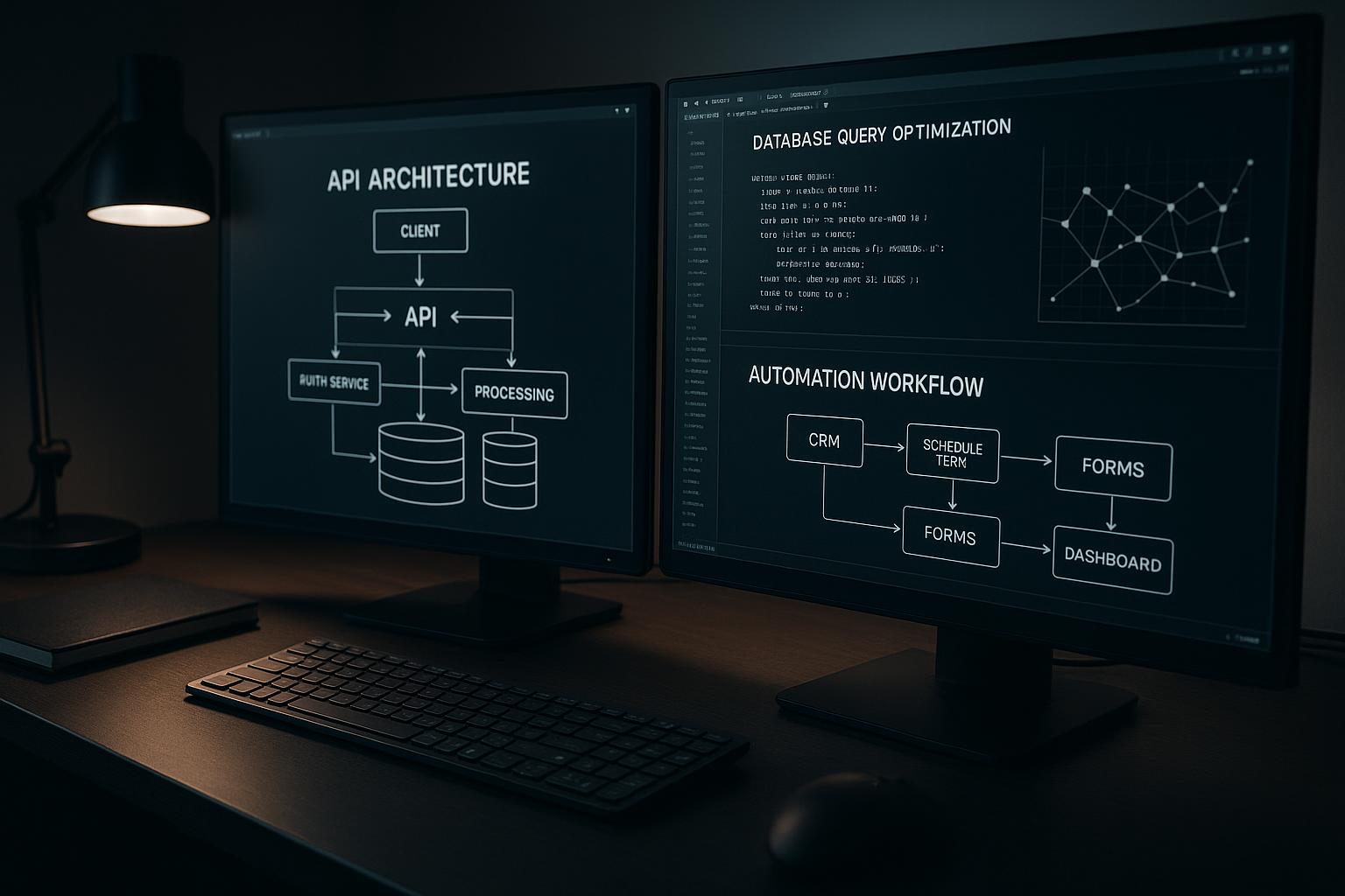
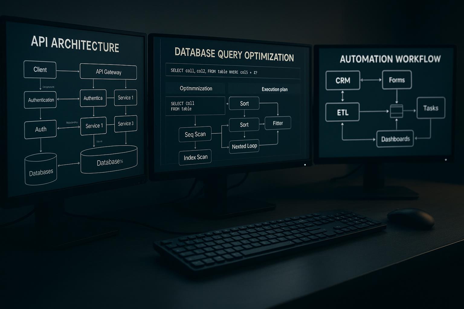
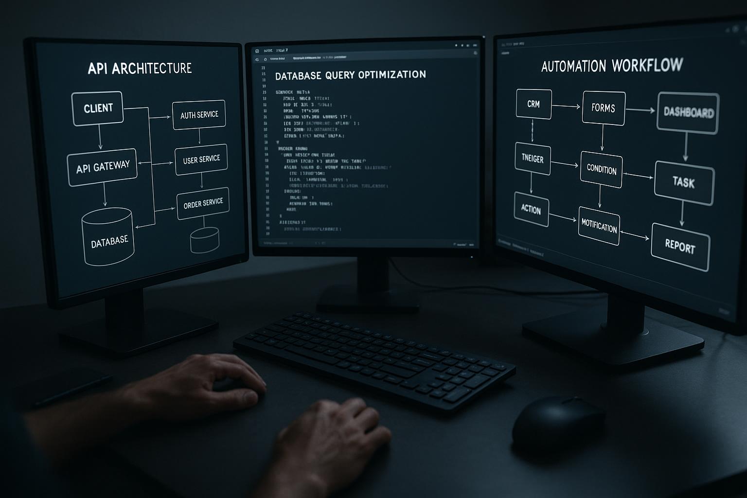
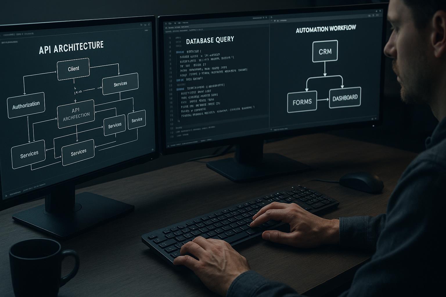
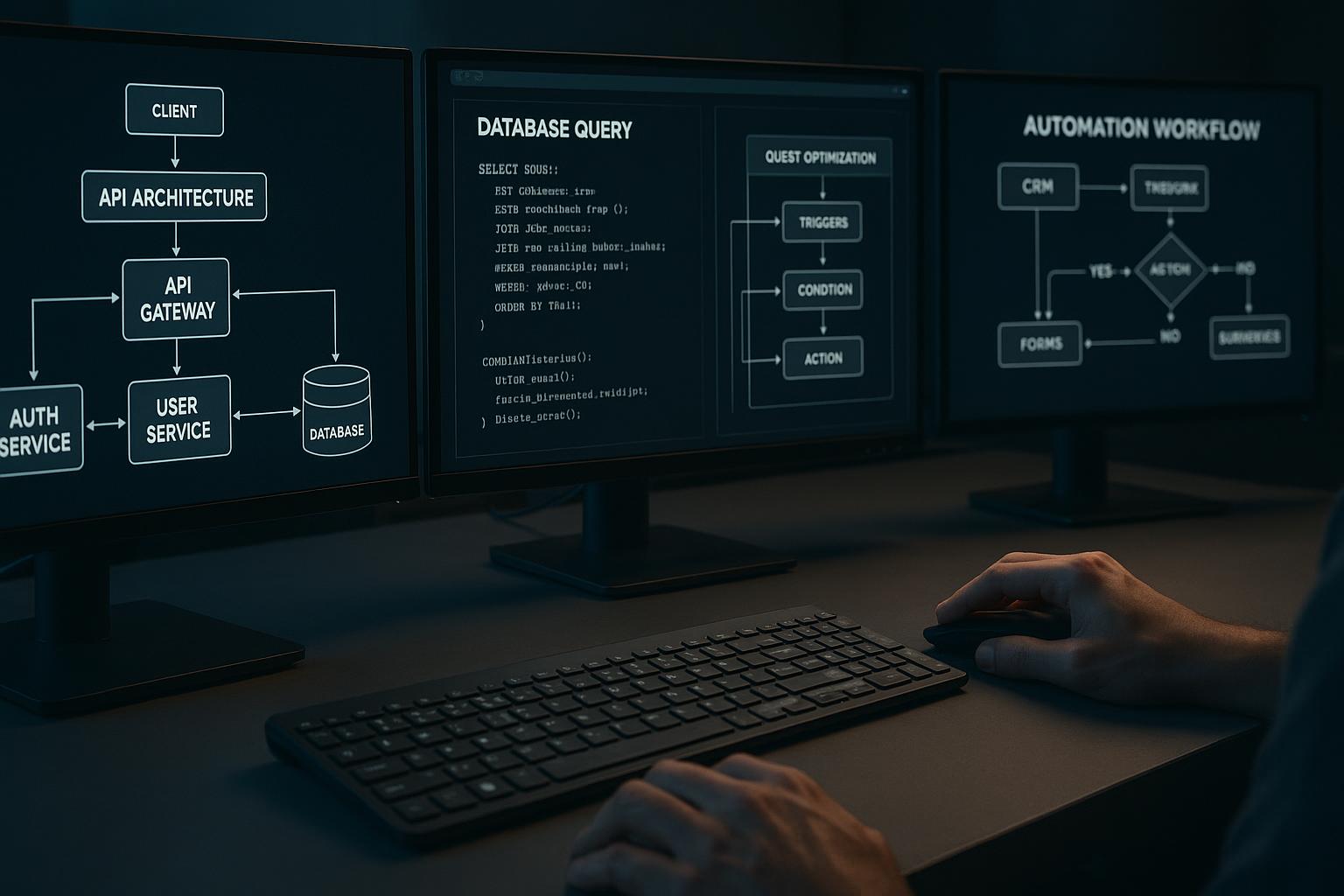
Responsive ColdFusion Web Designs combine the versatility of the ColdFusion programming language with modern responsive design principles. ColdFusion, developed by Adobe, is a powerful platform for building dynamic websites and web applications. When paired with responsive design techniques—such as flexible grids, images, and media queries—the result is websites that automatically adjust their layout and content to fit the user's device.
This integration allows Los Angeles businesses to create websites that are not only visually appealing but also highly functional across all devices, ensuring they meet the expectations of today’s tech-savvy consumers.
Top Benefits of Implementing Responsive ColdFusion Web Designs
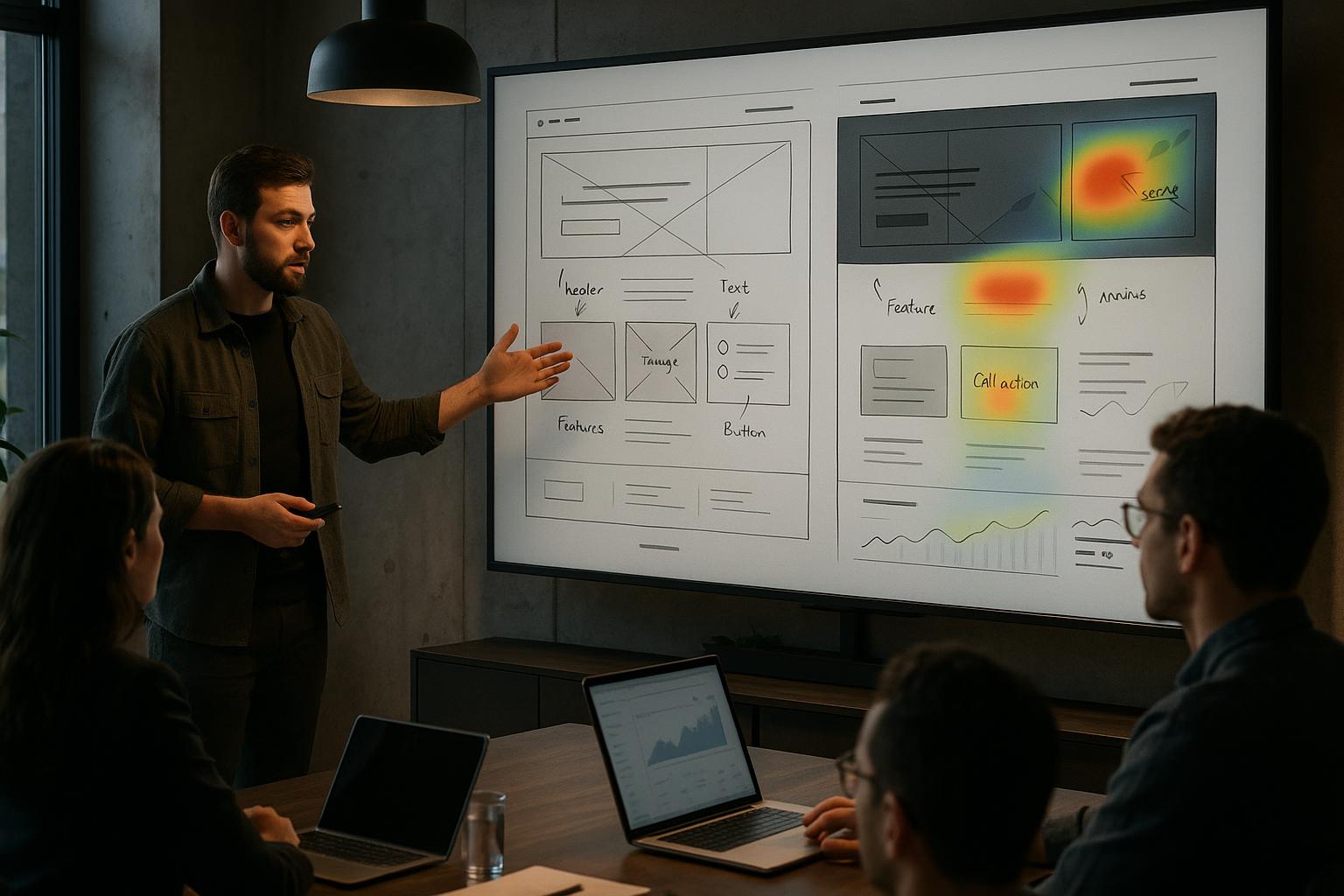
1. Improved User Experience and Engagement
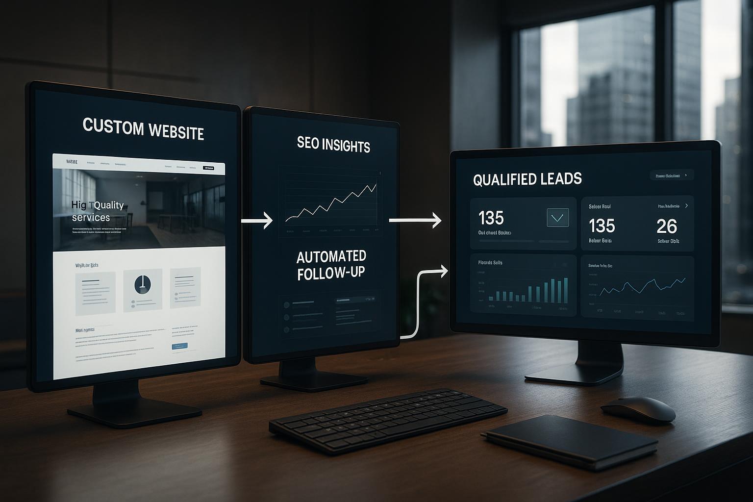
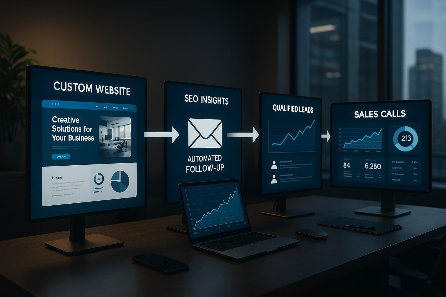
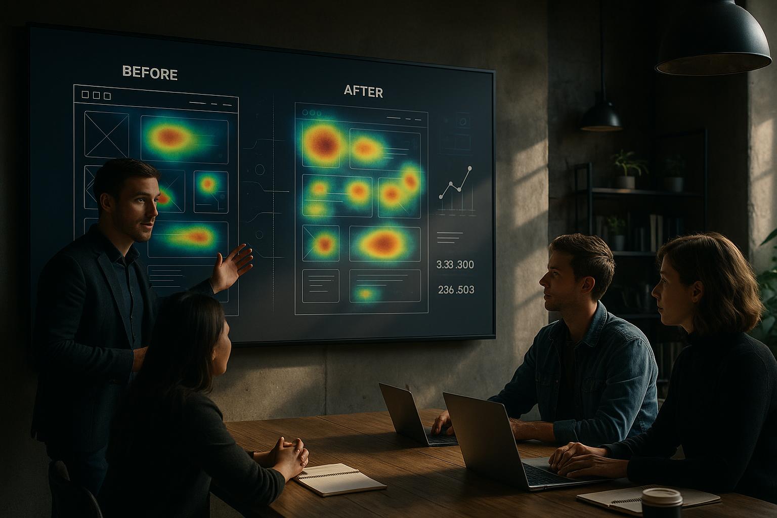
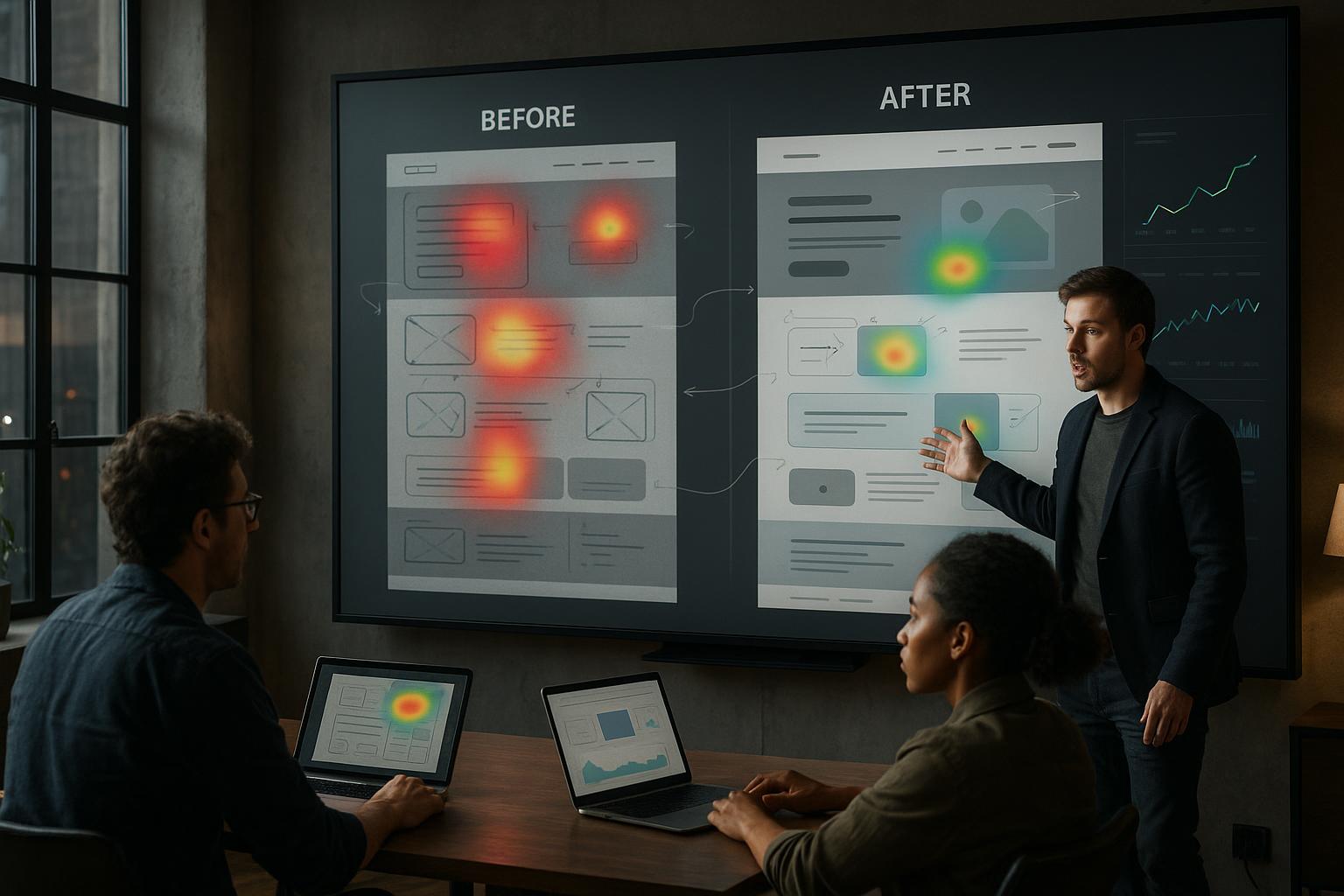
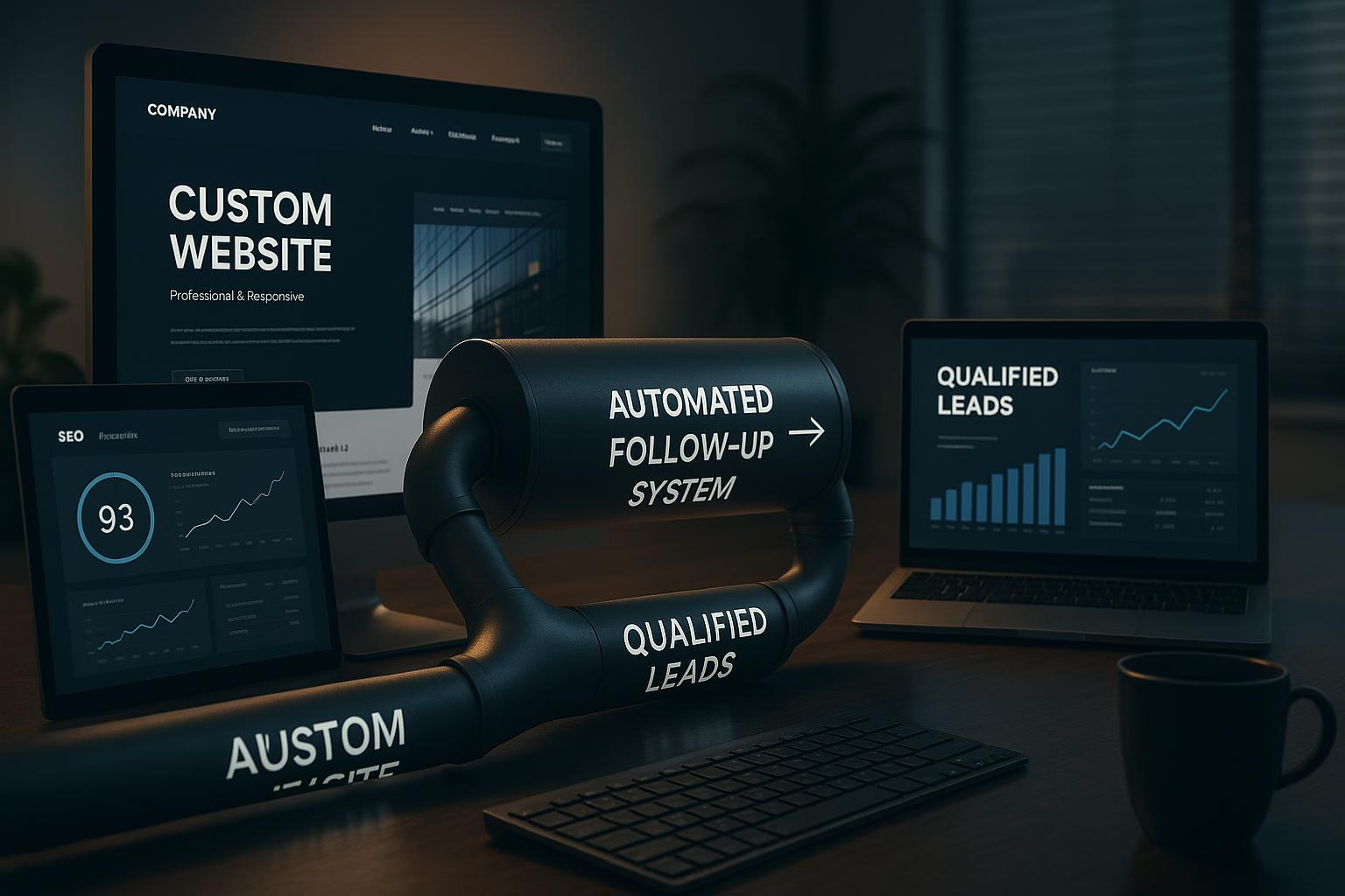
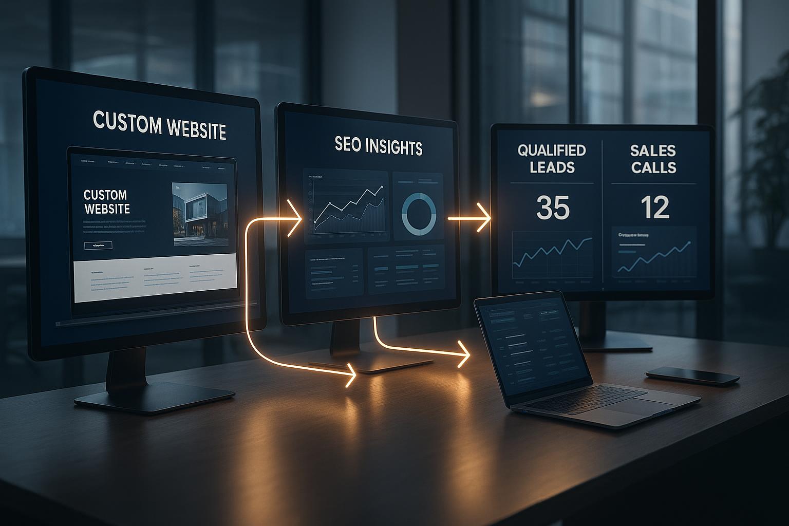
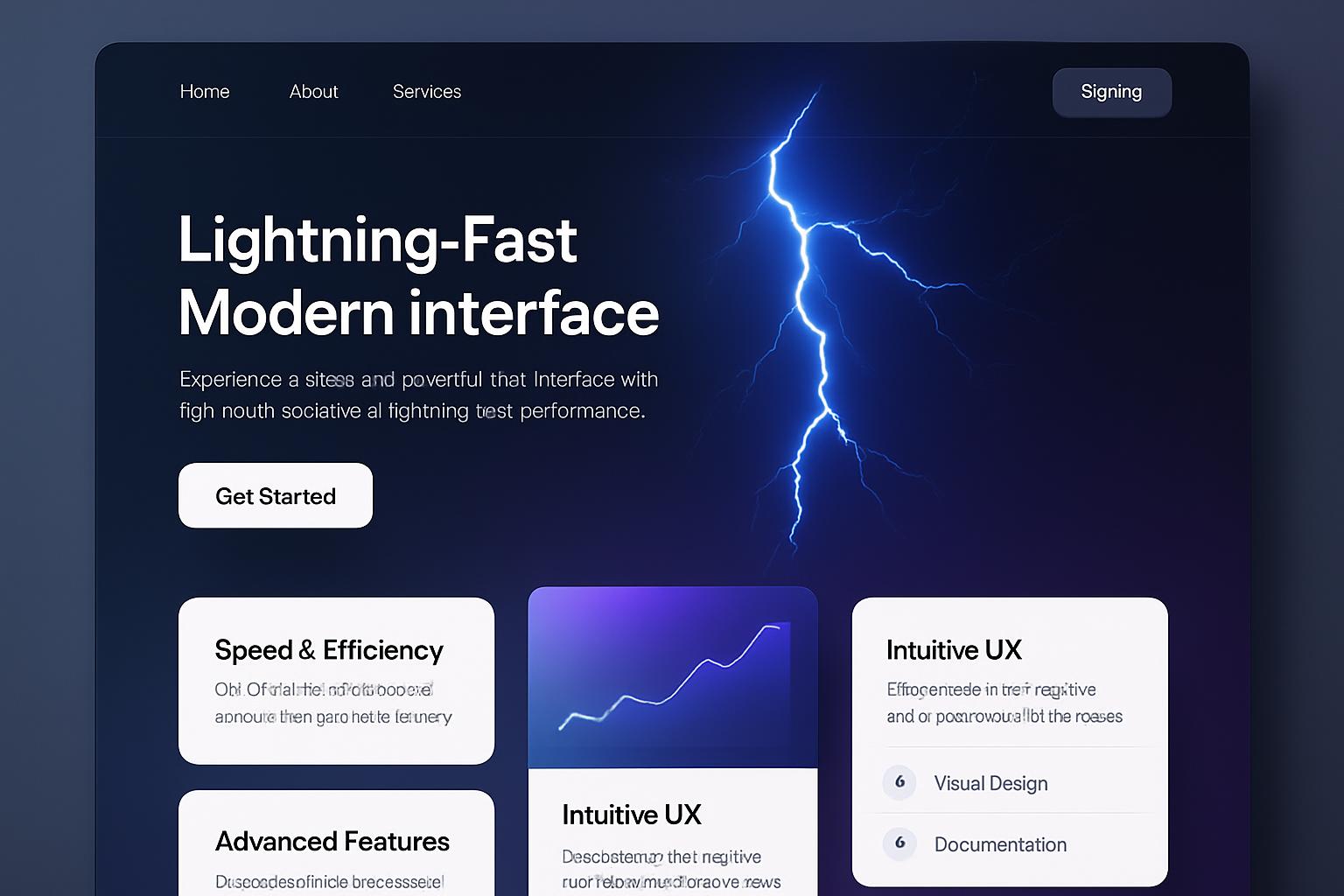
Responsive ColdFusion Web Designs provide a seamless browsing experience, reducing frustration caused by poorly optimized sites. When users can easily navigate your website on any device, they are more likely to stay longer, explore more pages, and convert into customers. This increased engagement directly impacts your bottom line.
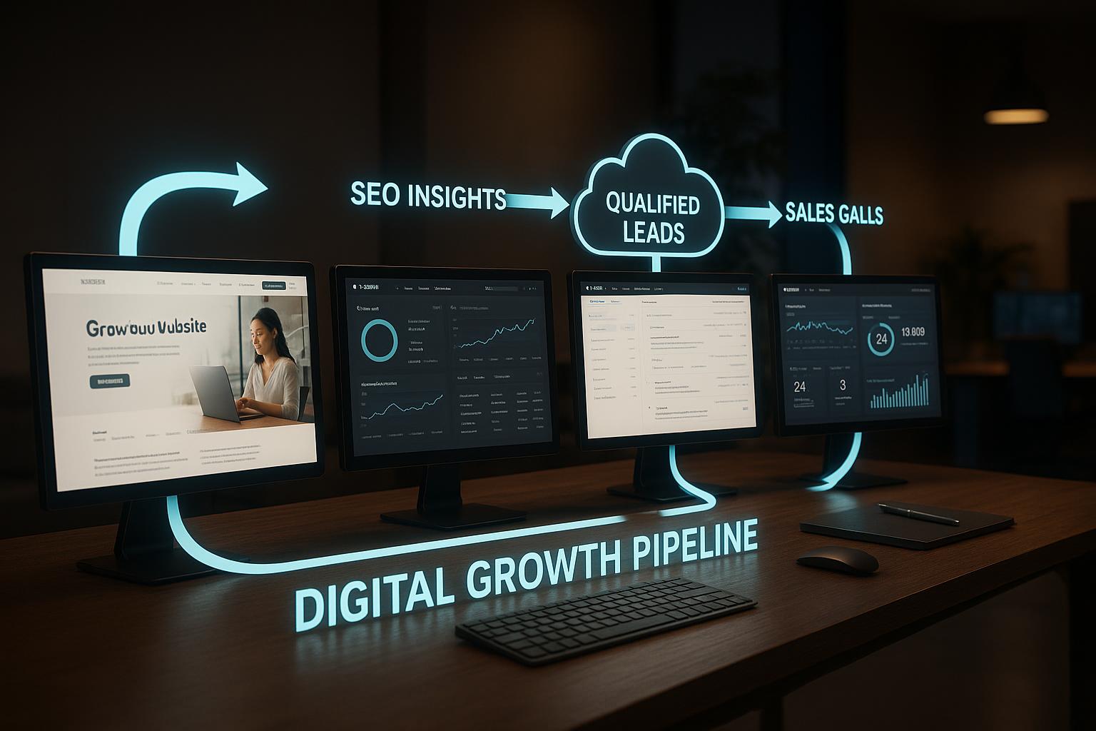
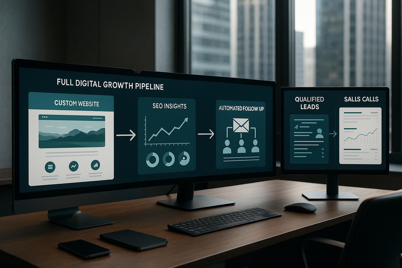
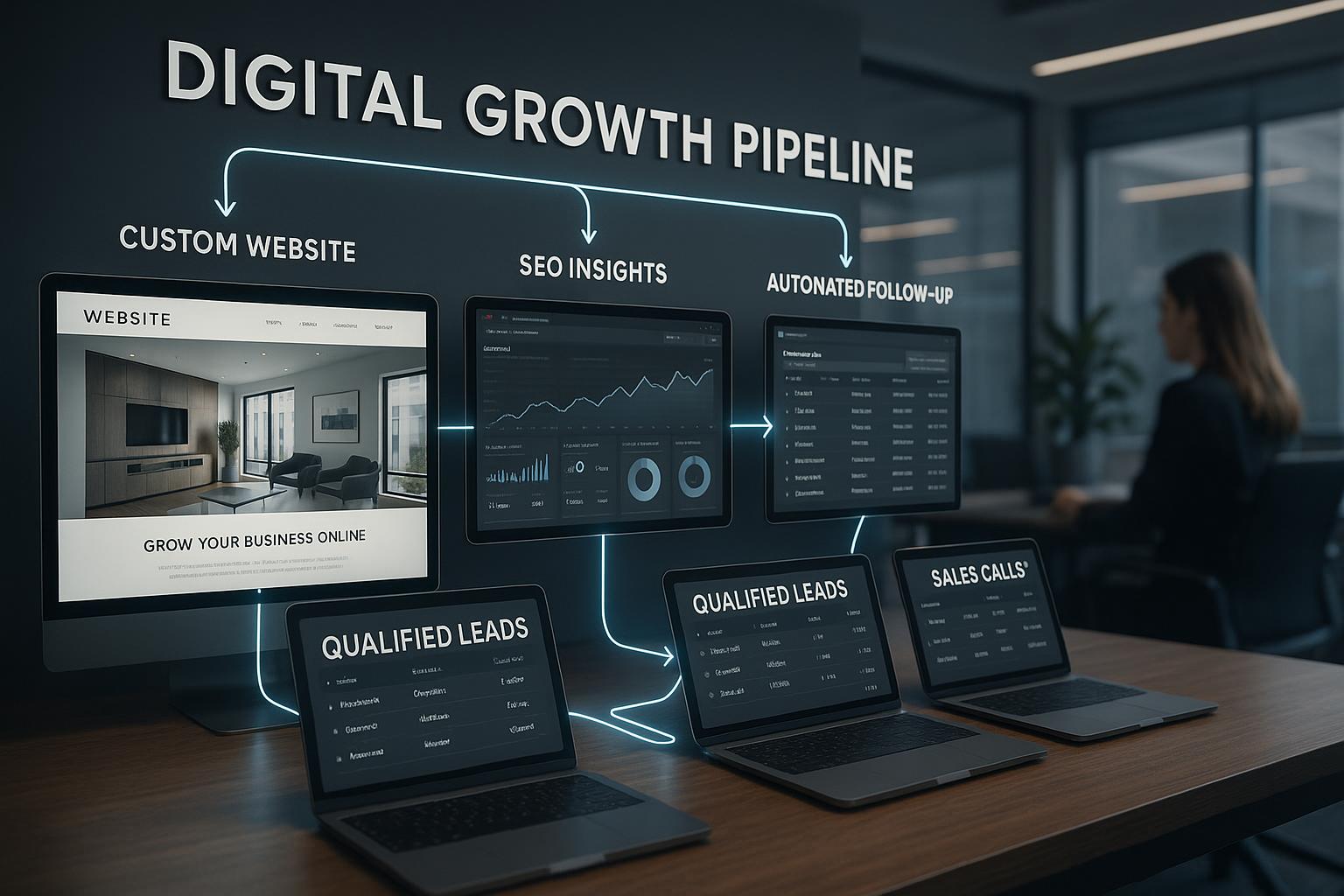
2. Enhanced SEO Performance
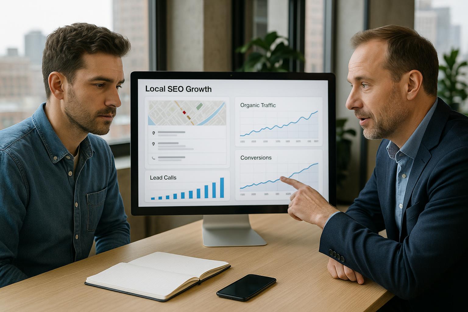
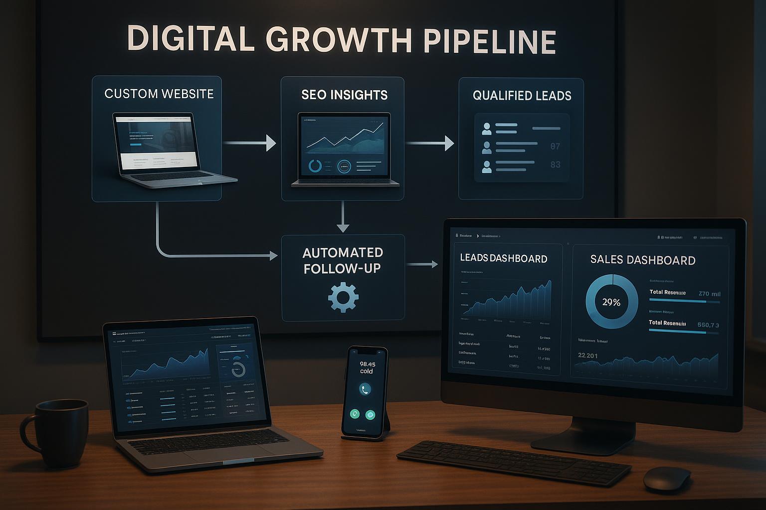
Search engines like Google prioritize mobile-friendly websites in their rankings. By adopting Responsive ColdFusion Web Designs, you ensure your website is optimized for search engines, improving your visibility in local Los Angeles searches and attracting more organic traffic.
3. Cost-Effectiveness and Ease of Maintenance
Maintaining a single responsive website is more economical than managing separate desktop and mobile sites. ColdFusion's robust framework allows developers to update content and features centrally, ensuring consistency while reducing long-term costs.
4. Faster Load Times and Better Performance
Responsive ColdFusion websites are optimized to load quickly across devices, even with rich media content. Faster websites improve user satisfaction and reduce bounce rates, which are crucial factors for SEO and conversion.
5. Future-Proof Your Website
With technology constantly evolving, Responsive ColdFusion Web Designs ensure your website remains adaptable to new devices and screen sizes. This flexibility protects your investment and keeps your online presence competitive in Los Angeles’s bustling digital market.
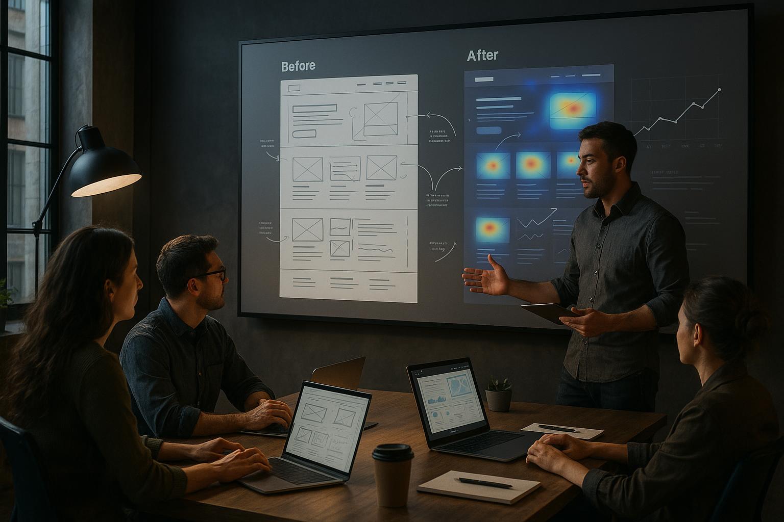
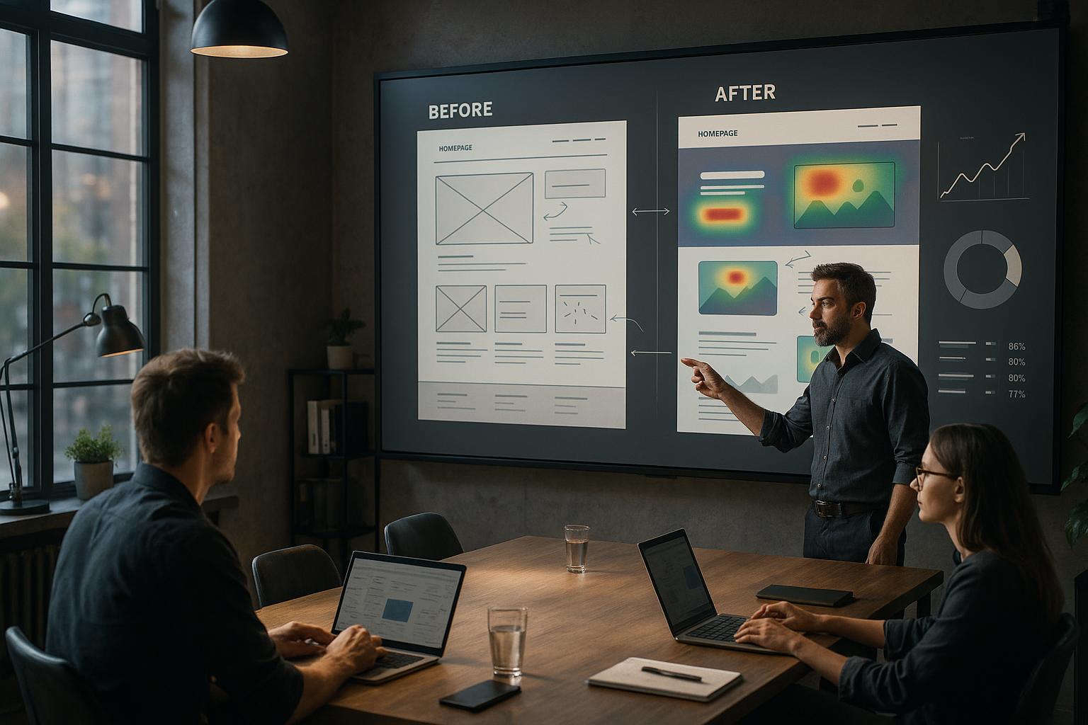
Steps to Implement Responsive ColdFusion Web Designs
- Assess Your Current Website: Identify areas that need improvement for responsiveness and performance.
- Plan Your Responsive Layout: Work with top-tier graphic designers and developers to craft a flexible, mobile-first design.
- Utilize ColdFusion Frameworks: Leverage ColdFusion’s built-in features and frameworks to develop dynamic, responsive pages.
- Optimize Images and Media: Use scalable images and media queries to ensure fast load times.
- Test Across Devices: Conduct thorough testing on various devices and browsers to ensure compatibility.
- Deploy and Monitor: Launch your responsive ColdFusion site and continuously monitor performance and user feedback for improvements.
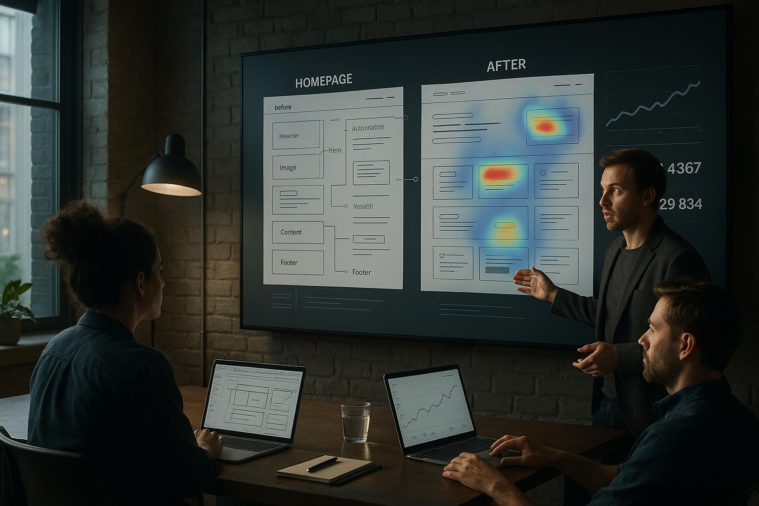
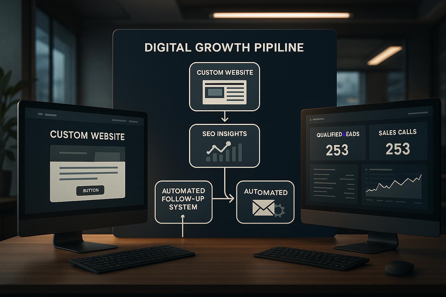
Real-World Example: Los Angeles Retail Business
A popular retail store in Los Angeles recently upgraded their website to a Responsive ColdFusion Web Design. Post-launch, they observed a 35% increase in mobile sales and a 20% reduction in bounce rates. The redesign enabled their customers to browse products effortlessly on smartphones and tablets, resulting in higher customer satisfaction and increased revenue.
Why Choose Full Blown Studio for Your Responsive ColdFusion Web Design?
At Full Blown Studio, we pride ourselves on being Los Angeles’s premier web development firm specialized in Responsive ColdFusion Web Designs. Our team comprises Expert level web developers, Certified Expert ColdFusion developers, top-level graphic designers, and MySQL and MSSQL database experts. We are committed to delivering tailored solutions that align with your business goals.
Our proven track record in creating visually stunning, highly functional, and responsive websites makes us the ideal partner for your project. We understand the local Los Angeles market and can help your business stand out online with a website that captivates and converts.
For more information, please contact us at support@fullblown.com or call (661) 429-0940.
Contact Full Blown Studio
Partner with Full Blown Studio to harness the full potential of Responsive ColdFusion Web Designs. Our expertise guarantees a website that not only looks great but also performs flawlessly across all devices, ensuring your Los Angeles business remains competitive in the digital age. Reach out today to discuss your project and discover how we can elevate your online presence.
Testimonials
“Full Blown Studio transformed our outdated website into a sleek, responsive ColdFusion platform. Our mobile traffic has increased dramatically!”
- Jane Smith, Los Angeles Retail Owner
“The team at Full Blown Studio is highly professional and knowledgeable about Responsive ColdFusion Web Designs. They delivered exactly what we needed—on time and within budget.”
- Mark Johnson, Small Business Owner
Frequently Asked Questions (FAQs)
1. What exactly is a responsive ColdFusion web design?
It is a website built using ColdFusion that adapts seamlessly to different devices and screen sizes, providing an optimal user experience across desktops, tablets, and smartphones.
2. Why is responsiveness important for my Los Angeles business?
Responsiveness ensures that your website is accessible and user-friendly on any device, which can significantly increase engagement, reduce bounce rates, and improve your search engine rankings.
3. How long does it take to develop a responsive ColdFusion website?
The timeline varies depending on the complexity of your project, but typically, a standard responsive ColdFusion website can be developed within 4 to 8 weeks.
4. Can you update my existing ColdFusion website to be responsive?
Absolutely. Our team can assess your current website and implement a responsive redesign to improve functionality and appearance across all devices.
5. What makes Full Blown Studio the best choice for web development in Palos Verdes?
Our extensive experience, certified ColdFusion developers, top-tier designers, and proven success in delivering high-quality, responsive websites make us the premier option for your web development needs.